Historical Type
We know a bifurcated serif when we see one. We can pin down a period style without sacrificing creativity.

Tickets, cheap printing, hand-painted signs and banners were all references for 5 Cents to Dreamland: A Trip to Coney Island at the New York Transit Museum

Early 20th century flourish and railroad typography for this exhibition on the history of Penn Station for the New York Transit Museum


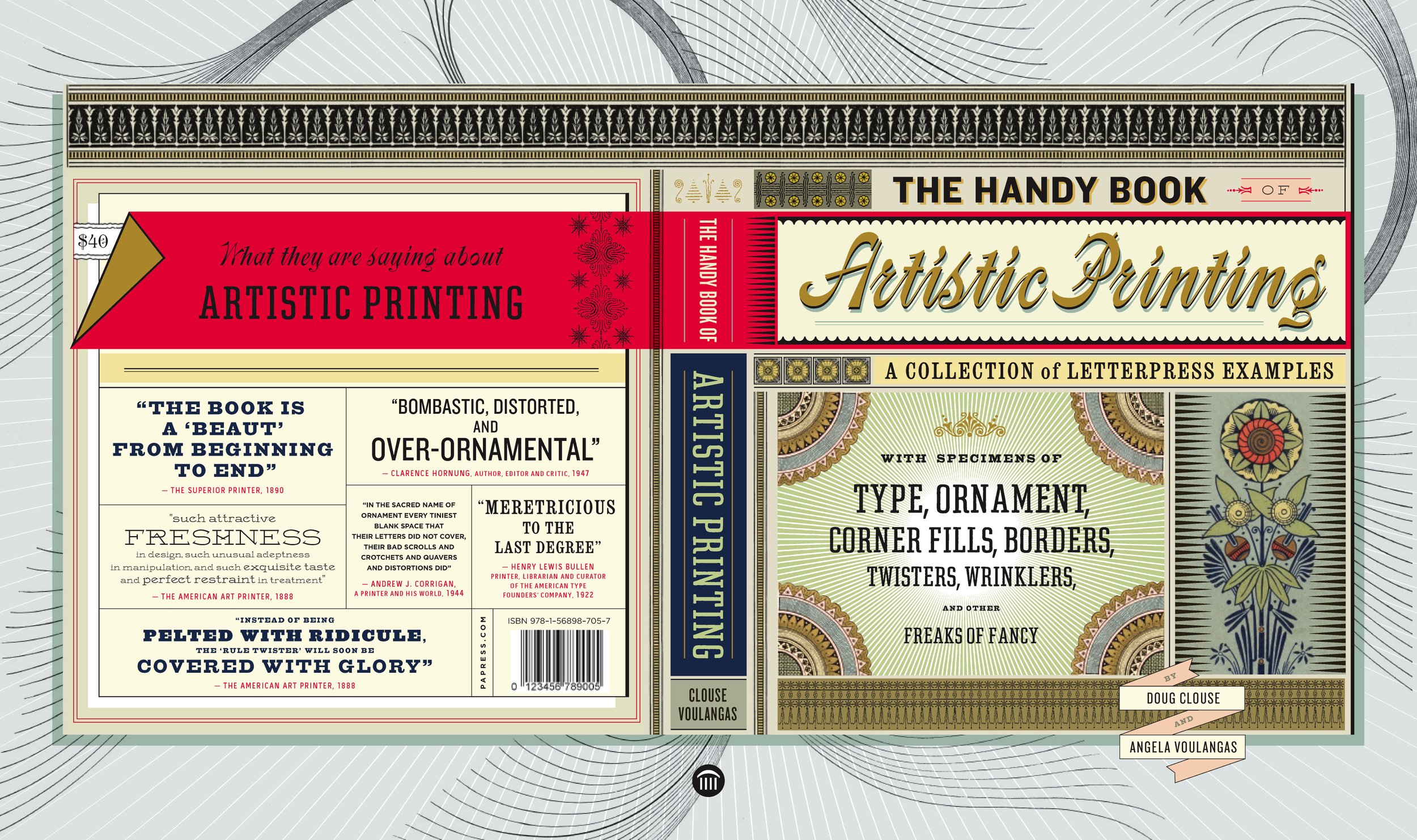
We channeled 19th century ornamental excess for the design of our book on Victorian letterpress printing.

Yesterday's tomorrows and 1930s Moderne for the New York Transit Museum

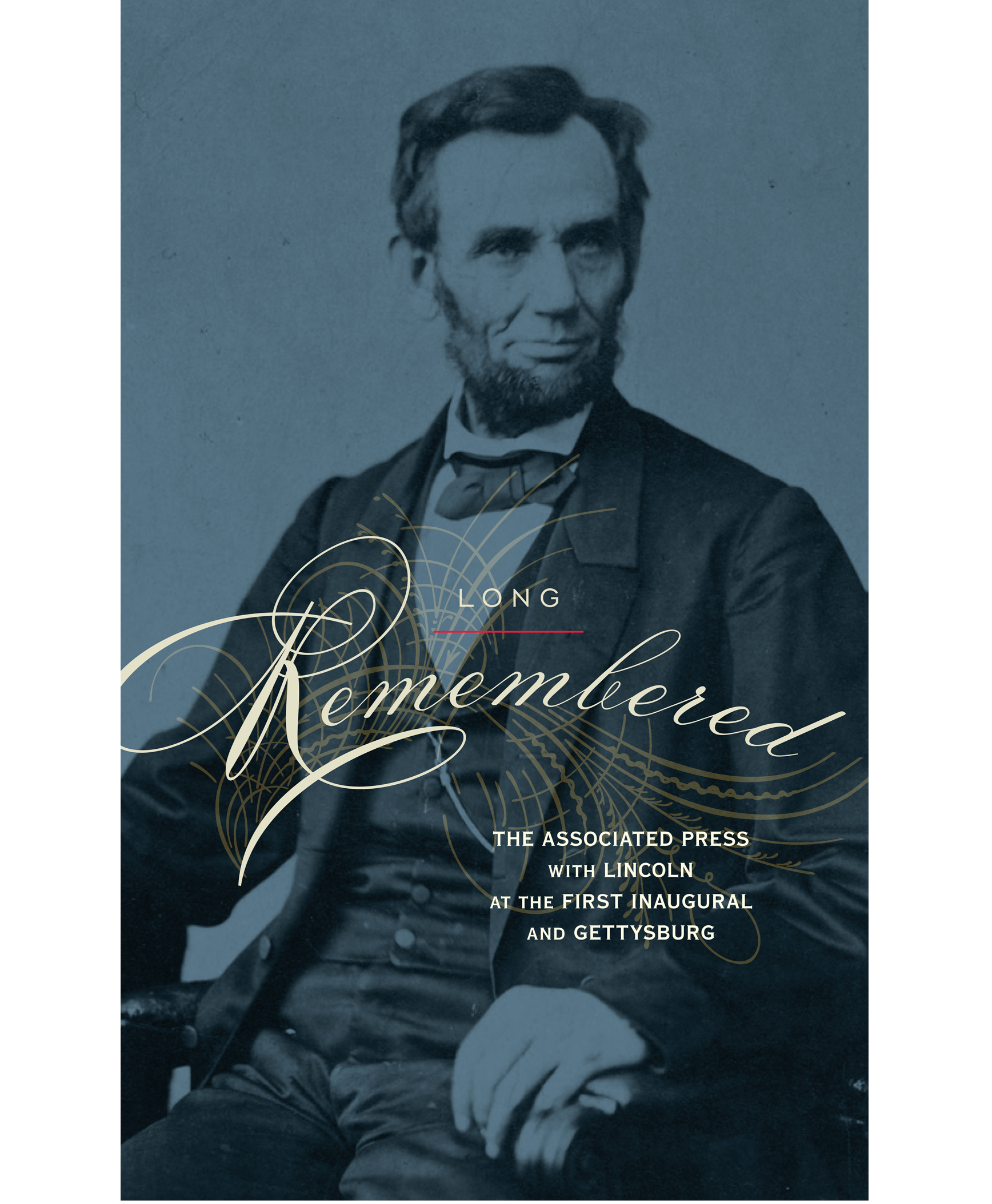
We evoked 19th century penmanship and engrossing for this publication for the Associated Press.

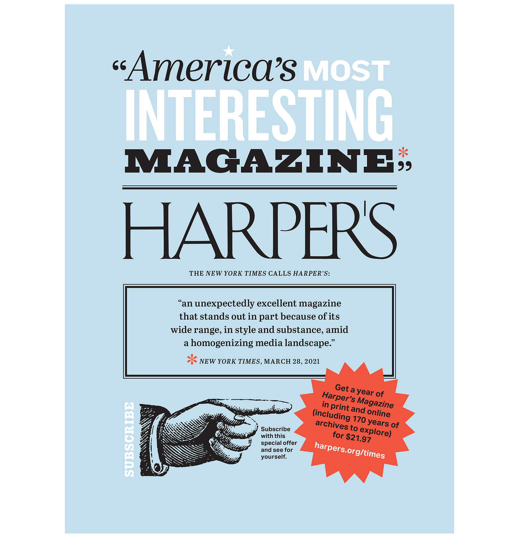
Harper’s Magazine gets a touch of 19th century broadside typography.
